

In the spring of last year I made the decision to re-design my visual identity for mountain bakery. It wasn’t an easy call to make because Tristan (my v talented husband), had previously done all of my design and website, and having had it the same for about 5 years I was naturally pretty emotionally attached to it. The design and colour palette were great when setting up the blog initially, but as time rolled on, I felt more and more that I wanted to freshen up my look, and I knew I wanted a simple and Scandinavian-influenced visual id to suit my evolving needs.
I did a whole load of research, and a lot of Instagram lusting, and then fired off an email to Sarah Abbott who designs and illustrates under the name Watersounds. I love her work like crazy, and have done for years, so I knew that I would be stoked to collaborate with her. Initially I heard nothing back, but then out of the blue I got a reply from her saying that she’d be happy to design a new logo for me. I was elated!
In particular I have always loved a pattern that Sarah created called ‘Stems’, so I asked if she could design something really pared back for me that incorporated a similar look, but with a little pop of colour. She then came back to me with sketches for about 20 different designs, all of which were lovely and I could easily have used. It was a toughie but I eventually chose the bones of what would become my new logo out of the layouts she gave me.
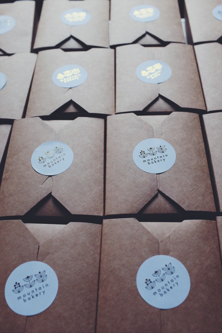
Sarah tried the logo in caps and lower case, and eventually we settled on all lower case as it felt softer and more akin to what I stand for: less shouting and more calm. I must confess that after this I tinkered with the font, as I had some compatibility issues with my Mac, but I loved the type in Futura so much (blame my love of all Wes Anderson films), that I decided to stick with it.

At the moment I use my logo on stickers in gold, because I love the way it catches the light, and also on this website, and on t-shirts in the reversed white and mustard yellow version. I hope you’ll agree that it looks great! In future I’ll be having it on my upcoming cookbook (yes, that’s happening! It’s a self-published affair that I am working on currently), and on more packaging.
I’m so delighted with the design that Sarah created for me, and now, nearly a year later, I love it just as much as the first time I saw it among the initial sketches.
Check out Sarah’s brilliant work on her website and also why not treat yourself to something lovely from her shop? You deserve it!
